Friday, December 21, 2018

Mid Term Submission

If there were this type of magazine out on the market and in stores, I would definitely be drawn in. The colors for my magazine are bright and fun with the yellow, blue, and white scheme. The layout is easy to read and follow. I use three main fonts throughout the entire magazine to keep consistency and organization. The photos I used were the best photos from my photoshoot that were clear and displayed the product nicely. The titles and descriptions are not of elevated language but more colloquial since it is a lifestyle, fun magazine. The targeted audience is those with Celiac disease or is gluten sensitive or just wants to live a healthy, gluten-free lifestyle. The pages are not cluttered with too many photos or too many words but contain sufficient information and are eye-catching. 


Photo Shoot

The majority of my photos are after the recipe was made and was shots of the final product in different settings and lighting. I did use my mom as my model who held the cup which is the photo for my cover but from research, most of the food shots were done on tables with different backsplashes and backgrounds, less with people. It was easy to schedule my mom to help because she was home to help. I used my outdoor patio table for some shots and then the kitchen table for the others. I thought the green picnic patterned cutting board and woven basket added to the summer/spring look I was going for so I used them in my photoshoots. 


Final photos in magazine

I chose these 4 photos to include in my four pages of my magazine because they are different shots and were the best out of all my photos taken. The lighting and angles of each of these photos were what I envisioned in my head before I had even taken any photos. 


Development process of my magazine

Since my two-page article is an easy, summer, gluten-free dessert, there was no interview needed. However, the process of choosing a recipe for the two-page was thorough. I wanted it to be a "no-bake" recipe that included fruits since it's for summer. Once I decided on the dessert, I had to manipulate the recipe to make it gluten-free friendly. This included doing research to find foods such as graham crackers that were gluten-free. Surprisingly, the food industry has increased in gluten-free brands and foods. In the end, the development of my dessert recipe was very educational in that I found some new brands that cater to those with Celiac and a new summer treat for anyone!

Flat Plan

The other articles I included range from gluten-free recipes to the science behind celiac to anything summer related. My purpose for that was to include everyone in the Celiac community or anyone who is gluten-free and give tips and ideas and recipes to have the best summer they can. The ads in magazines I researched were in between each article and can be many pages long, so I imitated that by placing ads on either side of the articles on my flat plan. 


Table of Contents

For my contents page, I chose to put a minimal amount of articles on display to magnify the articles on the page. I also chose articles for that season of the year which is spring/summer. Since it is a June issue, some fitting articles I used were: fathers day gift guide and fitness guide. I chose one photo for this page to enhance the articles featured. I used a basic but clean font for the title because I did not want attention on the title but on the articles that are listed. The font for the articles is the same Bembo font to keep the consistency throughout the pages similar. 


Front Cover

The title of my magazine is Celiac Living. I came up with the title because I have Celiac Disease and have noticed that there are plenty of Vegan and Vegetarian magazines on the market but little to no magazines for those with gluten intolerance. Instead of making just a food magazine with gluten-free recipes, I decided to create a lifestyle magazine for those with Celiac because it is a complete lifestyle change. I chose the font, Bembo, for my title because I felt it is an elegant, legible font that is extremely appealing to the eye. For the body text, I chose Bodoni, a bold font to entice the readers into buying and reading the magazine.


Wednesday, November 28, 2018

Celiac Living Magazine Template

My purpose and goal of the cover of my magazine is to create a sense of happiness and positivity which I fulfilled by using bright colors such as white, blue, and yellow. The photo I plan to include is a close - up of the final creation of the summer dish from the two-page article. The goal of the photo is to be enticing to those who see the cover in hopes they will buy the magazine and recreate the recipe.  


Sunday, November 25, 2018

Magazine Project Genre Research 5

The cover of the Vegan Life Magazine, issue January 2017, pictures a vibrant dish that is very satisfying to the human eye. The bright yellows, greens, and whites all bring in the spring vibe which is when this edition was released. The preview texts on the cover are appealing and draw in the reader to the rest of the magazine. The cover stories are vegan recipes, cruelty-free beauty products, and a vegan challenge which all have photos pertaining to those articles to give visuals along with the words of the articles. Advertisements found were for vegan yogurt and artisan vegan meat which is found between the recipe articles. There is no distribution number available as well as no awards it has won. 

Image result for the vegan life january 2017


Magazine Project Genre Research 4

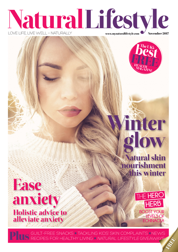
The magazine Natural Lifestyle, issue of November 2017, is all about loving life and living well naturally. The cover photo is a closeup of a woman with natural makeup and a chunky knit sweater which adds to the effect of fall/winter which is when this edition was released. The cover is full of bright colors such as pink and purple which are eye-catching to readers. The cover stories range from winter skin survival to healthy food recipes like fresh juice and bean soup. Those stories are found in the middle of the magazine and are multiple pages long. The advertisements which range from vitamins, ageless skincare, and supplements are found in between cover stories and throughout the whole magazine and are only one side of a page. All the advertisements are related to healthy living and are perfect marketing. Furthermore, the photos found throughout are associated with the articles they are found with such as images of the food for the recipes or people applying skincare for the skincare articles. There is no known distribution number and has not won any awards.
Image result for natural lifestyle november 2017

Magazine Project Genre Research 3

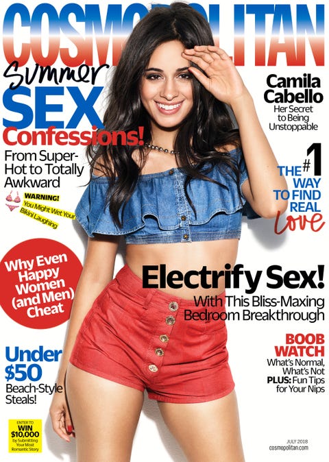
The cover layout of the July 2018 issue of Cosmopolitan is extremely pertinent for the season with colors of red, white, and blue. The focal image of Camila Cabello, a popular pop artist, serves to draw in young readers who are fans or familiar with her. The type of articles included are: how to find real love, wellness, and horoscopes. The photo found on the table of contents is a young woman in a bathing suit on the beach and similar photos are found throughout the magazine since it is a summer edition. The cover stories such as how to find real love and the article about Camila Cabello are found toward the center of the magazine and take up several pages. The advertisements which consist of makeup from Maybelline, body lotion from Dove, and other beauty and skincare products are spread throughout the magazine. However, they are focused more on the outskirts or beginning and ending of the magazine. The distribution number is around three million and has won the GLAAD Media Award for Outstanding Magazine Overall Coverage. 

Image result for cosmopolitan july 2018


Tuesday, November 20, 2018

Magazine Project Genre Research 2

This lifestyle magazine called Shape, issued in December 2017, features articles on rejuvenating your skin, gift guides, and fast meal ideas. The cover layout is vibrant with the use of colors such as orange, yellow, and red as well as an almost full body photo of a popular actress, Emma Stone. This is a strategic marketing strategy in that it draws in a young audience that is familiar with her work. This issue also contains a gift guide which is appropriate for the season in which it was released. The photos that appear on the cover and table of contents relate to the cover story to draw the audience into the main purpose of the magazine. The preview texts found on the cover are enticing and foreshadow what the inside contains. There are several advertisements found throughout the magazine that include: protein shakes, detox tea, and skin products which are all geared to this younger, healthier audience that this magazine is marketed for. The distribution number is about one million for this magazine and has not been nominated for any awards. 


Image result for Shape magazine issue december 2017

Monday, November 12, 2018

Magazine Project Genre Research 1

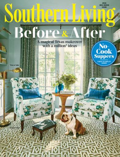
The first magazine I researched was the August 2018 issue of Southern Living. The cover layout is eye-catching in that the colors are bright such as white and yellow. The font is large and legible, allowing the reader to easily read the words. There are articles ranging from quick and easy summer recipes to how to decorate the ideal house. These multi-paged articles are found in the middle of the magazine between advertisements. The photos featured are clean and sophisticated which match the overall theme of the magazine. Photos of furnished rooms and gourmet meals are placed throughout the magazine to draw the audience in. Continually, there are no records of the distribution number or whether it has won any awards. Overall, this magazine has a great flow throughout with coordinating colors and fonts as well as photos that visually portray the information.


Image result for southern living Before and After August 2018

Tuesday, November 6, 2018

Project Selection - My Decision

After reviewing the skills I possess for both the film and magazine project, I have chosen the magazine. I have more excitement over making the magazine than the film which is important because I will be spending a lot of hours and effort on the project. The skills I possess such as being technologically proficient will be of use. I also am aware that I am extremely camera shy and not the best actress which could hinder the film project if I chose it.  My magazine will be a lifestyle magazine for those living with Celiac Disease. It will have gluten-free recipes and tips on how to live a healthy lifestyle with food restrictions. I am going to work alone. Over the years of my high school career, I have found I work best alone, however, I do know the importance of team effort. Conclusively, I'm excited to begin creating a lifestyle magazine where I can show my creative freedom as well as showcase the knowledge I have recently acquired in this class.

Friday, November 2, 2018

Project Selection - Film

From watching movies such as Ferris Bueller and All the President's Men, I have been exposed to the many different aspects of film. From camera shots to angle movements and editing, I have seen the various options that I could apply to a film. I also love being able to use creative freedom which is exactly what I would be doing for this project. It also helps that I'm an avid movie watcher of all genres because I have seen the different ways that films are produced and what the conventions are. On the contrary, I feel as though I would have a hard time deciding which genre I would use and what the storyline would be. I can be creative but when it comes to picking a scenario, I would be too indecisive and overwhelmed about what to make my film about. Furthermore, I am very camera shy as well as not a very good actor. I am poor at memorization and feel as though I would be a drawback when it comes to filming. Overall, I have more drawbacks than skills for the film project.

Thursday, November 1, 2018

Project Selection - Magazine

Aspects of print journalism that may interest me based on what we have learned is that I can use my imagination to create a printed work about anything that interests me. I also would be able to have creative freedom in that the layout and design of the magazine would be up to me. I am also a big magazine reader. From Healthy Living to People Magazine, I get sucked into the world of print.  From looking at other magazines in class, I have noticed the importance of the layout and design of the magazine, more specifically, the font, color, and pictures which all help draw the reader's attention. Personally, I think this may be the best project for me. I have taken basic technology classes such as IIT and web design which may be of use when creating the magazine. I am also certified in Word, Powerpoint, and Excel so I feel comfortable with editing on computers when it comes to pictures and text. However, I am not sure of the editing software, Publisher, which is used for editing the magazine so that may be a challenge I could face.